Warning
You are reading an old version of this documentation. If you want up-to-date information, please have a look at 5.4 .Dashboard
The page provides information on the system. (Fig. 54)
When the system is not in production, the only element you see is the system state of EYE+, check EYE+ states for more details about each state.

Fig. 54 DASHBOARD when system state is not production
Production dashboard
If the EYE+ state is production, the dashboard (Fig. 55) displays some information about the current production.
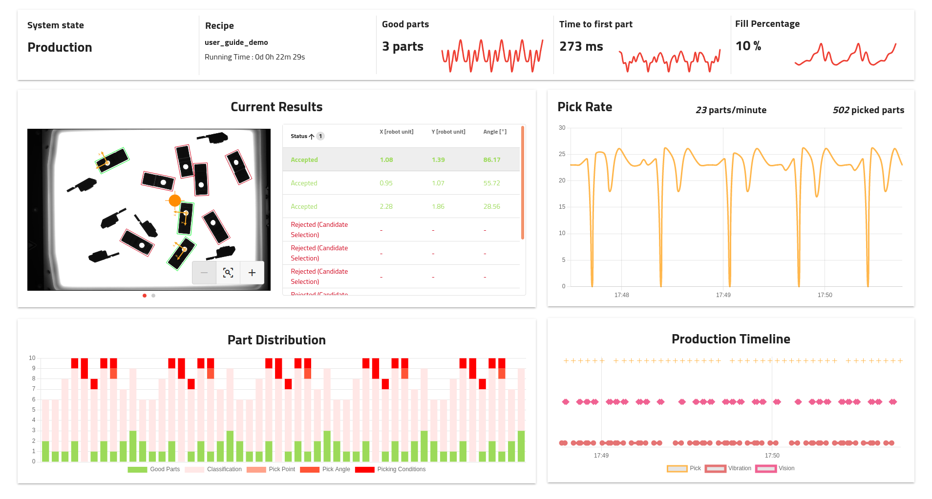
Fig. 55 Production dashboard
Note
The information is displayed in real time but is not permanently saved on the EYE+ controller. When stopping the production, the latest data will still be visible but will be discarded when refreshing the interface.
Tip
Clicking on the small button on the bottom right opens the interface in full screen mode which ensures you can see the complete dashboard on an HD screen.
Upper area

Fig. 56 Production dashboard: Upper area
The upper area displays global information about the current production and is divided into 5 areas:
System state: Current EYE+ state. Most of the information is displayed only when in production.
Recipe: Name of the recipe currently in production and elapsed time since the start of production.
Good parts: Number of good parts detected during the last image analysis. The chart shows the evolution of this value over the last 50 runs.
Time to first part: Time the system took to find the first part during the last image analysis. This time also includes the time Asycube spent vibrating. the The chart shows the evolution of this value over the last 50 runs.
Fill percentage: Fill percentage measured by last image analysis. The chart shows the evolution of this value over the last 50 runs.
Current Results
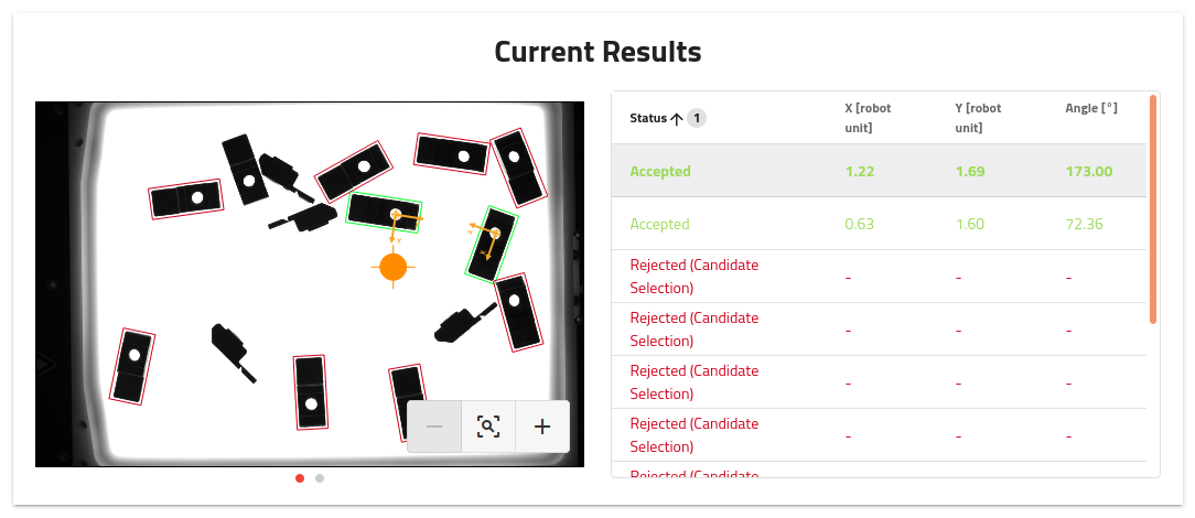
Fig. 57 Production dashboard: Current Results
Displays the results of the latest analysis. You can navigate between the different images using the navigation dots below the image.
On the right, the list of candidates with their status (accepted or rejected), position coordinates (in robot unit) and angle is displayed. You can click on the lines in the table to highlight the desired part on the left image.
Tip
It is possible to export either the original full resolution image or the image with the overlay by right-clicking on the image area.
Pick Rate
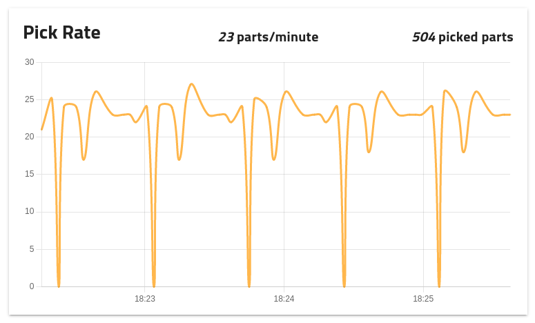
Fig. 58 Production dashboard: Pick Rate
The graph displays the pick rate based on the number of get_part requested per minute. Above it you can see the current pick rate, as well as the total number of parts picked since the start of the current production run.
Part Distribution
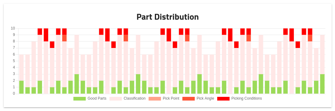
Fig. 59 Production dashboard: Part Distribution
The chart plots the distribution of the parts between accepted and rejected over the last 50 runs.
Note
The total number of parts may not always correspond to the actual number of parts on the platform as only those detected by the EYE+ vision algorithm (both good and bad candidates) can be counted.
Production Timeline
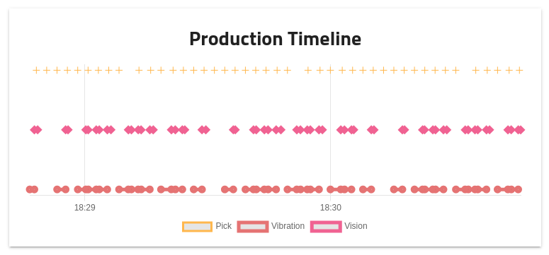
Fig. 60 Production dashboard: Production Timeline
The production timeline summarizes the events that occurred in the last two minutes of the current production run. The top line represents the robot picks (response to a get_part), the middle one the vision analysis and the bottom one the vibration sequences.
Note
If you want to create your own dashboard and integrate elements from the EYE+ Studio dashboard, have a look at Integrate EYE+ Studio dashboard.